Conceptual self portrait

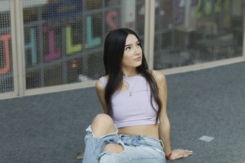
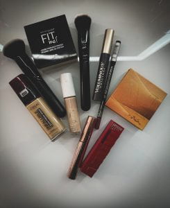
This photo relates to me because for those that know me, know that I love makeup. I would say every weekend I go to Ulta. I would say that’s one of my favorite makeup store. But the things you see in the picture are some of my makeup products I use daily. My favorite makeup product would be my lips, doing different lip combos. I know many people say like oh you don’t need makeup to feel pretty, and I know, but for me wearing makeup makes me happy, like it adds a better look to my outfit, or you glow different. But one thing is I can’t do makeup on other people, just me. It would not come out, because lowkey I kinda struggle on myself.

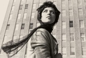
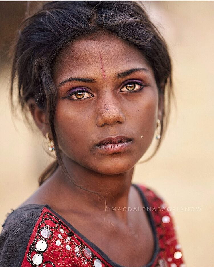
Out of all her photographs, this one stood out to me. I didn’t really like the clown ones, but I would stay those stood out more because of the bright colors and makes you look into the picture and think like why did she do this. This picture I like because its like a warm vintage color, like she’s looking at something, and with the building in the back makes it look more cool. I think the outfit or what she’s wearing matches the color of the picture.


3 National Geographic cover

I like this cover because it makes me want to read the article. And I would like to learn about this place. The cover is nice the water and the buildings.

I like this cover. I find it really cool, because it’s something we usually don’t see, he’s out of the spacecraft. I get chills seeing this. Like it makes you think what will happen next.

I like this cover because i really don’t know what it is, so i would want to know what it is, all I see is like houses and smoke. Or maybe its like how everything started to become land, cause i see water.

100 most influential Photos

Lunch Atop A skyscraper, 1932

 It’s amazing how those construction workers were able to enjoy their meal so high above Manhattan. Even though the photo was staged for a promotional campaign, it has become a powerful symbol of American resilience and ambition during the challenging times of the Depression.

Falling Man, Richard Drew, 2001

The image of the Falling Man is a haunting and powerful representation of the individual amidst the tragedy of 9/11. While many of the widely seen images focus on the planes and towers, this photo captures the bravery and desperation of one’s persons escape. The image faced backlash and controversy due to its graphic nature, but it serves as a reminder of the sacrifices made that day.

Earthrise, William Anders, NASA, 1968

The iconic Earthrise photo taken by the Apollo 8 astronauts on charismas Eve in 1968 was a turning point in our understanding of our world. It showcased the beauty and fragility of our planet and helped ignite the environment movement. it also reminded us of the preciousness of our home in the vastness of space. It’s a powerful image that continues to inspire awe and appreciation for the wonders of Earth.

White Balance and Write

White balance in photography is all about making sure the colors in your photos look true to life. Different light sources can give your images a tint, like a blueish hue under fluorescent lighting or a warm/yellowish tone under candlelight.. Adjusting the white balance helps you get rid of those color casts and make your photos look more natural. Color temperature in photography is about different light sources have varying color temperature along the blue- yellow spectrum. Warmer color temperatures, like those from candle flames or sunsets have a low kelvin value (around 3000 K), while cooler color temperatures, such as those from clouds or shade, have a high kelvin value (6000 K and beyond). Color casts can cause problems in photography. They make it  difficult to capture accurate colors and can give your photos an undesirable look. Whether you’re photographing a stunning sunset or showcasing products, neutralizing color casts is essential for portraying subjects as true to life as possible. In- camera white balancing is a useful feature that allows you to adjust the white balance settings before you take a photo. When you play the white balance, you can create different vibes in your photos. Adding a colder white balance gives a moody feel, while a warmer white balance creates a welcoming and nostalgic effect.

Travel poster

I would want to go there because, I’ve always wanted to go visit Europe or over there. But out of all the states over there the one that gets my eye is Pairs. I imagined how good the food and drinks are over there. The bread. I would want to explore everything. The first thing i would want to visit is the Effie tower

Lightroom edits

The three differences are first is saw editing, if you take photos in RAW format, you can manipulate them on lightroom straight away. Another difference is layer editing, if you think about cutting out a snippet of one paper picture and then placing it over the top of another paper picture, then you have essentially made a new picture with different layers. And lastly expansive tool set there is no denying that Photoshop has a Lot of tools. This can make it fairly daunting space for the novice. However, it is these tools that give Photoshop a general advantage over lightroom. A simlilarty

Portrait blur

10 tips to Good Portrait Photography

1.Use natural light

2.Find a background with low details

3.Focus on the eyes

4.Practice with different portrait lenses.

5. Shoot in RAW

6.Wide aperture is best for portraits.

7.Pay attentions to the background to see if its blurred.

8.Change your focus

9.Frame the face.

10. Learn from your mistakes

Words I would use for this portrait is character,calm,bold,pure,balanced,beautiful,colorful,unique,emotion,the reason why I choose this one or the one that popped more out to me because the color. And mostly her eyes. I feel like in this photograph or in portrait mode the eyes matter a-lot. And with the background being blurred the focus is on her.

Good and Shallow

Good

46 mm f/5.6 1/1000 sec ISO 400 EXP 0

Shallow

55 mm f/5.6 1/1600 sec ISO 400 EXP 0
This is good dept of field, I feel like the aperture is around f/4, Lens 14mm, 1/1100 sec, EXP 0 ISO

This is shallow dept of field. I would say this was my favorite part of this assignment, like making the background blur. I feel like the aperture is around 56 mm, f 5.6, 1/1600 sec, ISO 400 EXP 0

Framing a subject

18 mm f/13 1/25 sec ISO 3200 EXP 0
18 mm f/13 1/50 sec ISO 3200 EXP 0
21 mm f/13 1/250 sec ISO 3200 EXP 0

Yes, I feel like I have strong composition, all my photographs something inside the frame. I feel like a little of leading lines, and low lighting. I felt like I edited my photographs good, I tried to do something different, I went for a low lighting edit. What I would do different in this assignment next time is for sure shoot outside where the lighting is better. I feel like one out of the three could make it to the blog home page. But after seeing my other class mates photographs there is no best, I liked them all